Komodor Service Overview Tab
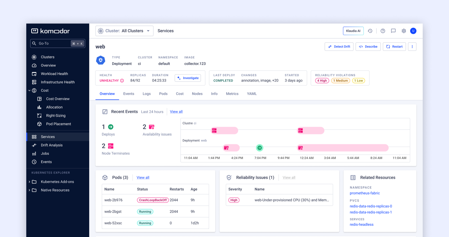
I initiated this redesign based on a mismatch I found in navigation data, not a stakeholder request, then iterated through usability testing after an initial layout underperformed with users. The final Overview tab passed testing, shipped, and became the new default landing tab for the Service View.
Context
Komodor is a Kubernetes troubleshooting, observability, and reliability platform, and the Service View is where developers land the moment something breaks — and where they end up spending most of their time on the platform overall. Getting that screen right isn't a cosmetic problem; it's the difference between developers finding what they need in a crisis and hunting for it.
The problem
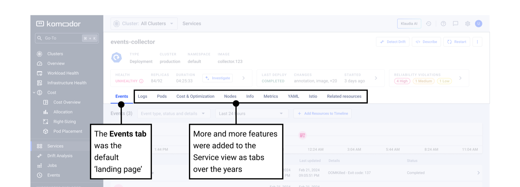
Over time, Komodor had shipped a lot of genuinely good functionality into the Service View: deployment tracking, availability and reliability issues, YAML inspection, node views, cost data — but each had been added one at a time. Individually, every addition made sense. Together, they became what I described internally as "patchwork": a screen exposing a growing list of capabilities with no coherent structure for finding or understanding them.
Outcome
- Initiated the redesign based on a mismatch found in navigation data, not a stakeholder request.
- Iterated through usability testing after an initial layout underperformed with users.
- The final Overview tab passed testing, shipped, and became the new default landing tab for the Service View.
Key stages
The patchwork problem
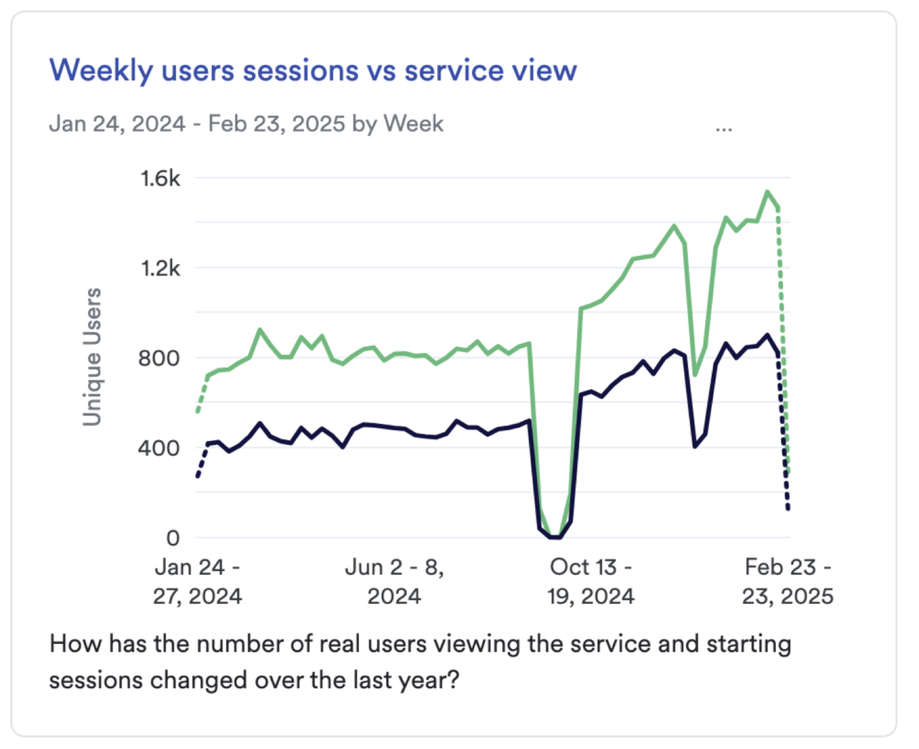
The Service View mattered because it was one of the platform's main centers of attention: over 50% of all user sessions included a visit to a Service View. That's not a secondary screen — it's core real estate, and whatever structure it had would shape how developers experienced the whole product. The risk wasn't a broken screen, it was a quietly underused one, with valuable functionality sitting a click or two away from where developers actually looked.
Making the case with data, not opinion
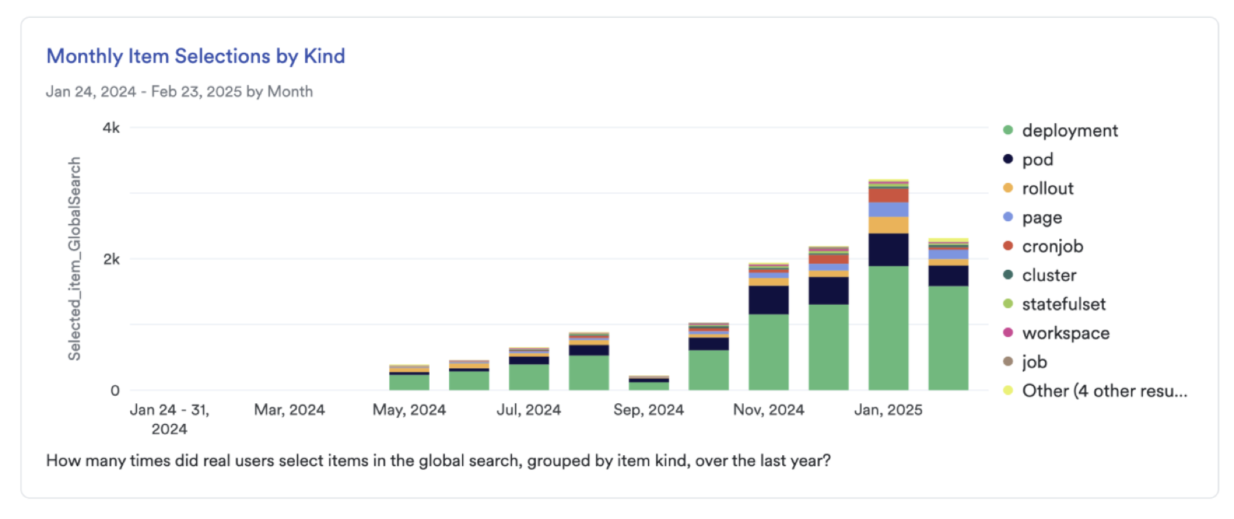
To make the case concrete rather than opinion-based, I pulled Command+K navigation data (Komodor's global "go-to" shortcut) to see where developers were actually trying to go once they'd landed on a service. It told a clear story: while the Events tab was technically the designed landing view, ranked by actual navigation frequency developer attention concentrated somewhere else entirely — Pods, then Logs, then the status indicator cards (Deploy, Availability, Reliability), then YAML, well ahead of Events. That gap between the designed entry point and the actual usage pattern was the clearest evidence that the screen's structure no longer matched how people worked.
Rather than pitching a feature list, I framed the opportunity around the developer persona: the Service View is where developers spend most of their time because it's what they care about — their service, their problem, their blast radius. That gave me one design principle to hold the rest of the proposal against: better expose Komodor's capabilities, new and old, to the developer persona at the moment they're already looking at what they care about.
Initial designs
My first pass at the Overview tab layout went into usability testing with real users, and it didn't hold up. Looking back, the layout ran on assumptions rather than the screen's actual job to be done, and it tried too hard to change an important part of the data — the events tab, while quickly navigated from, still let people glance at what recently happened and whether anything needed attention.
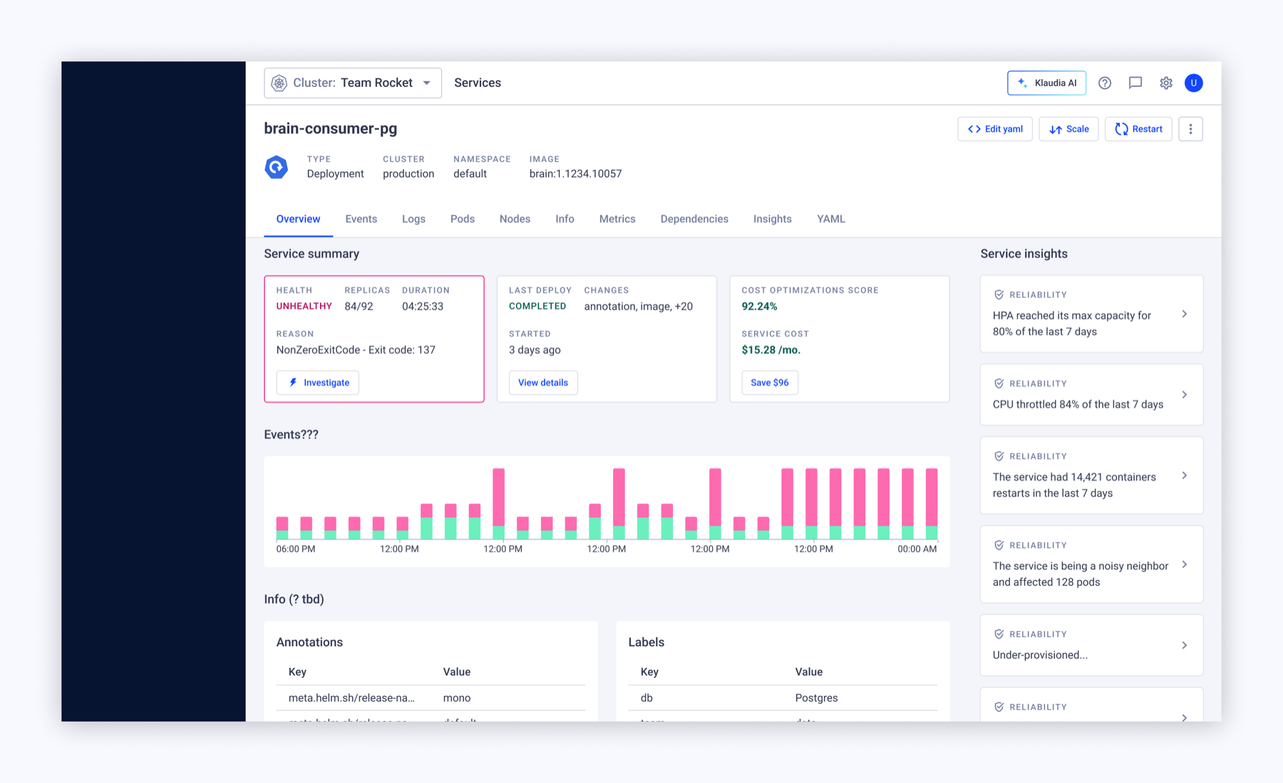
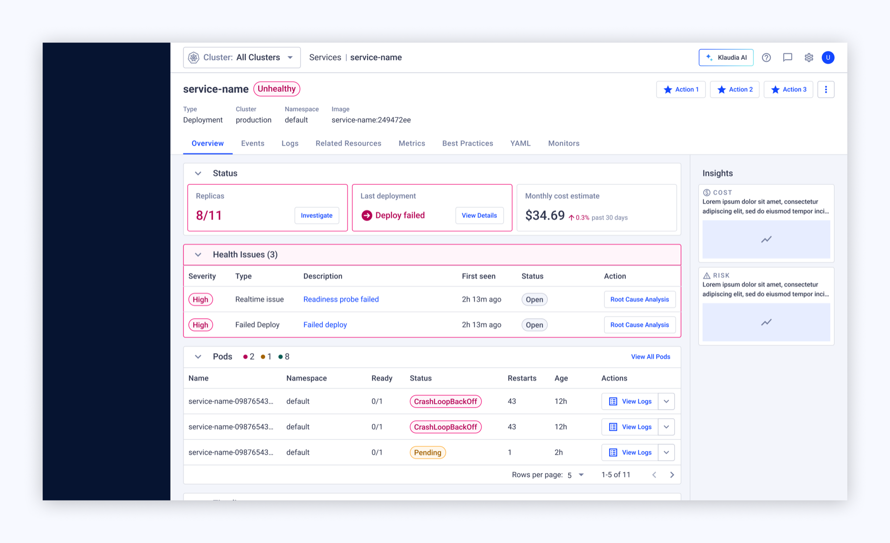
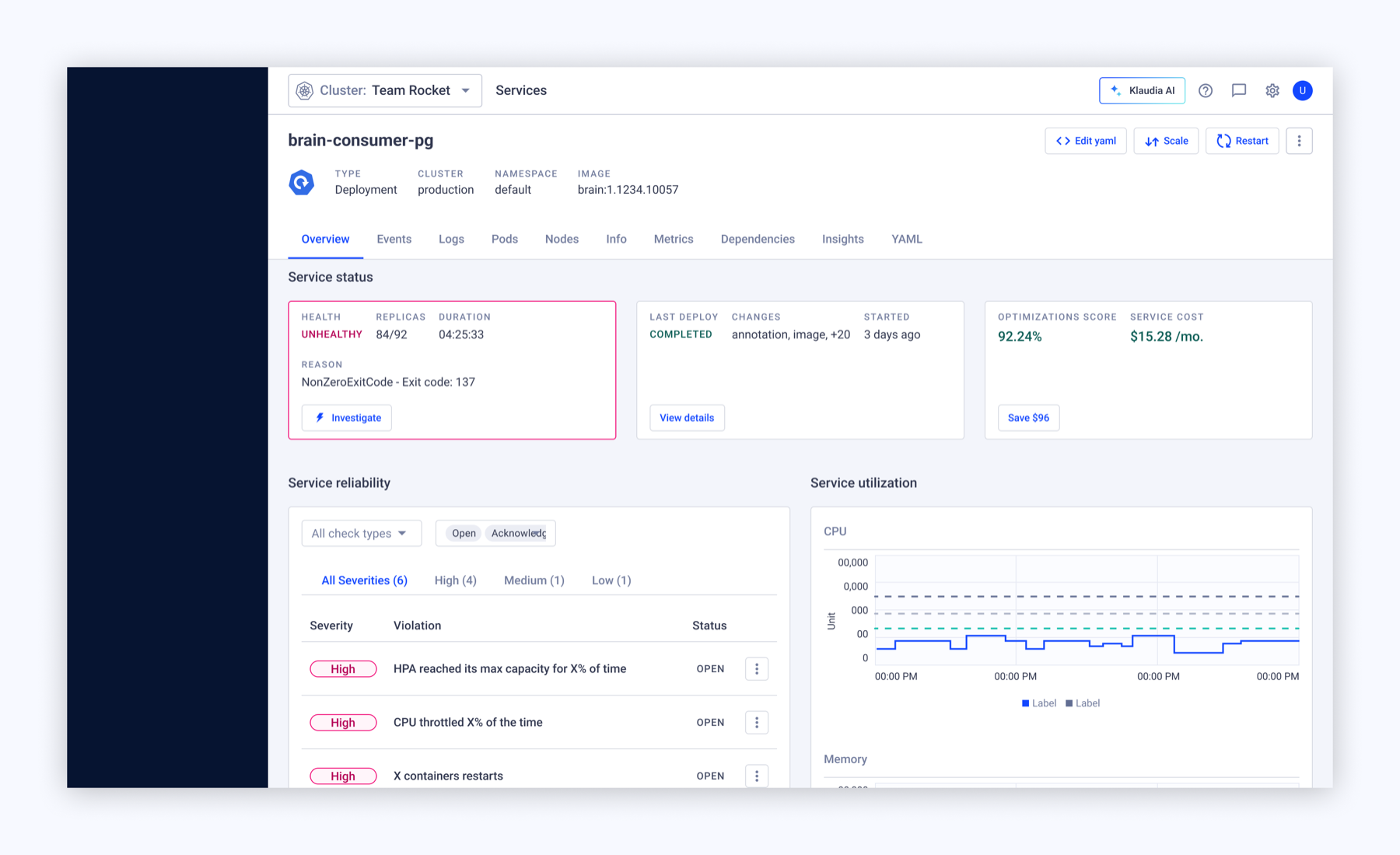
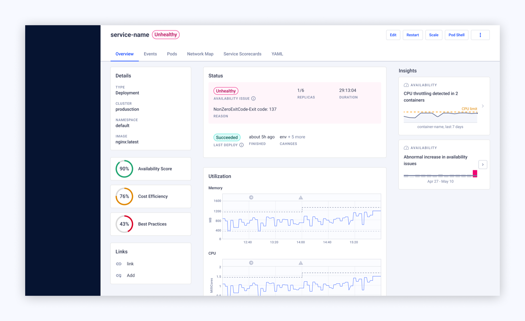
I reframed the design around a few questions: is my service okay right now? Or did something change recently? And if it's not okay, why — and where do I look? What else is this connected to, and to what effect? Reframing the layout around those questions turned the design from a collection of new ideas into something purposeful. That revised version went back through testing, and it worked — it gave developers a clear enough gain over the old, Events-first layout to justify the change.
Final design
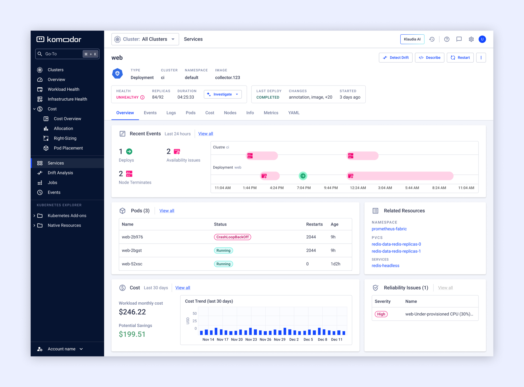
The shipped result: a single Overview tab as the new default landing point for the Service View, replacing the old Events-first entry with a layout organized around what developers actually came to the screen to do — check their service, understand their problem, and see its blast radius.
- The Events section was kept, where people knew and liked it, but minimized to a quick glance.
- Pod data was surfaced alongside related resources to show connections.
- Cost data and trend were shown properly for the first time in the service context, so a service's financial impact was visible.
Impact
The redesign shifted the Service View from a screen that had accumulated capability without structure to one with a deliberate entry point — closing the gap between where developers were designed to land and where the navigation data showed they actually wanted to go.
Beyond the screen itself, the persona-first framing gave the team a reusable filter for evaluating future feature additions to the Service View, so the same patchwork problem is less likely to re-accumulate silently over time.