Reliability Violations
Komodor's platform scans clusters for a set of out-of-the-box reliability issues: outdated Kubernetes versions, high container restart counts, CPU throttling, and more. Each violation type surfaces very different kinds of data, so a single generic "alert card" wasn't going to cut it.
From a list to impact groups
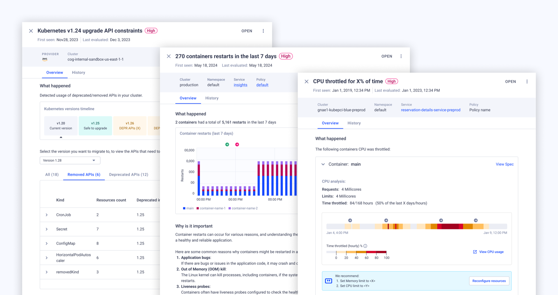
The first version of this was a flat list of violations. It worked, but it didn't answer the question users actually had first: what is this actually affecting? We restructured the top-level view around impact groups — Node Pressure, Degraded Service, Cluster Upgrades — each summarized by the outcomes it's causing (e.g. "12 noisy neighbors, 456 victims, 7 under-provisioned workloads") before a user ever drills into an individual rule.
A consistent shell, an adaptive core
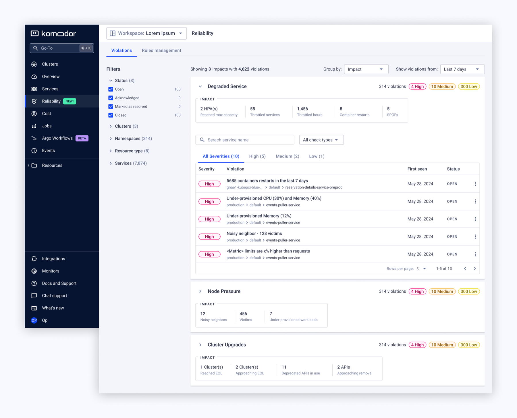
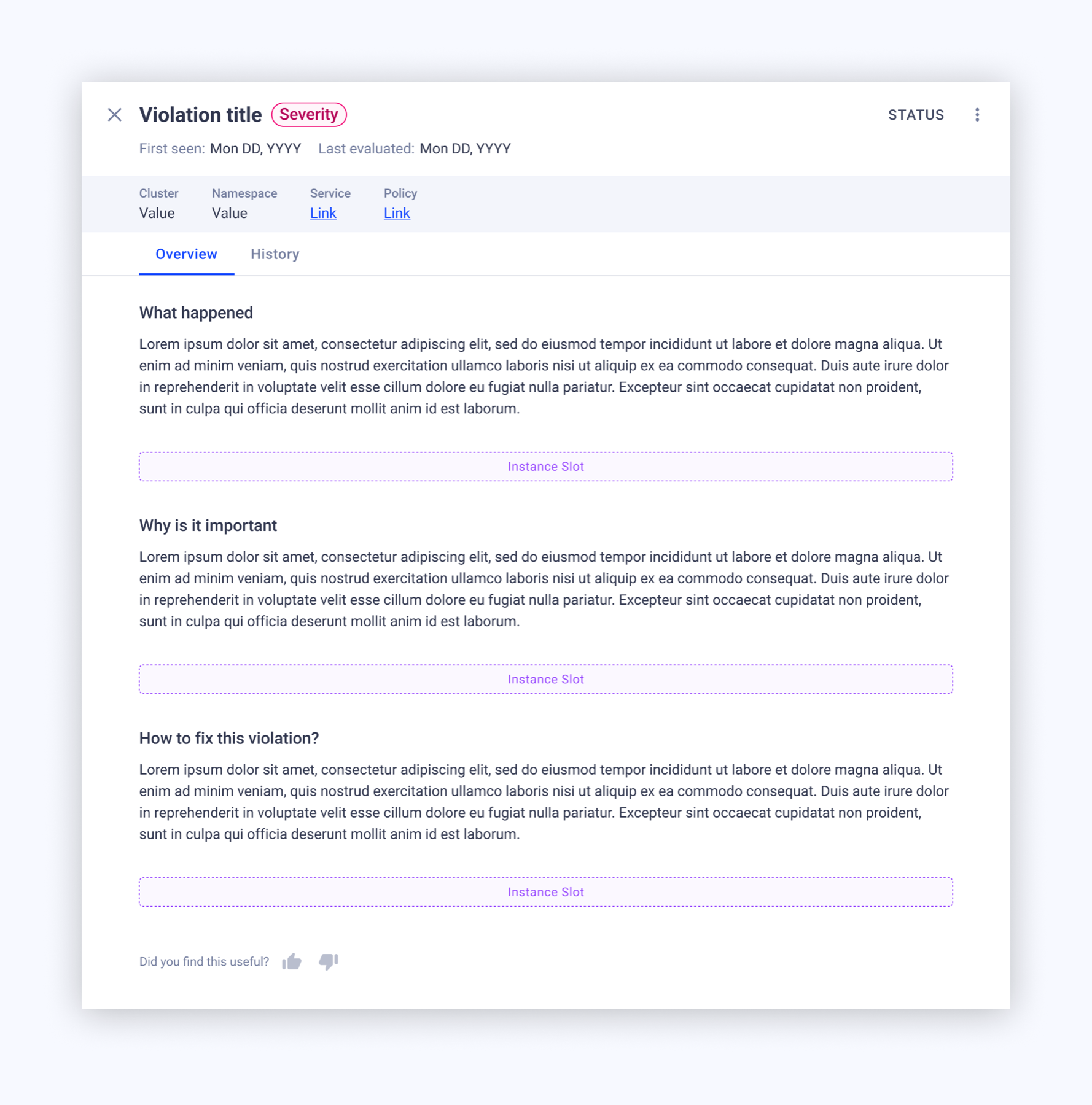
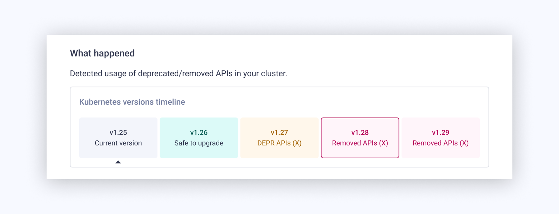
Every violation detail view followed the same three-part structure: what happened → why is it important → how to fix this. That consistency means users always know where to look. But the "what happened" section changes shape depending on the relevant data:
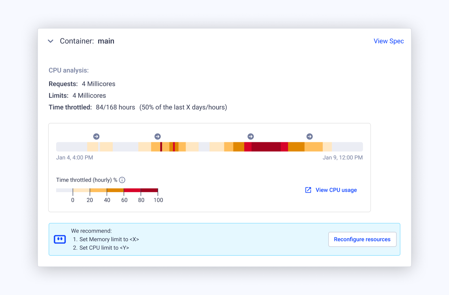
- CPU throttling — a timeline heatmap and hourly throttle bar, because this is fundamentally a question of when and for how long.
- Cluster end-of-life — a static fact card (version, EOL date, time since) plus a warning callout, because this is a point-in-time state, not a trend.
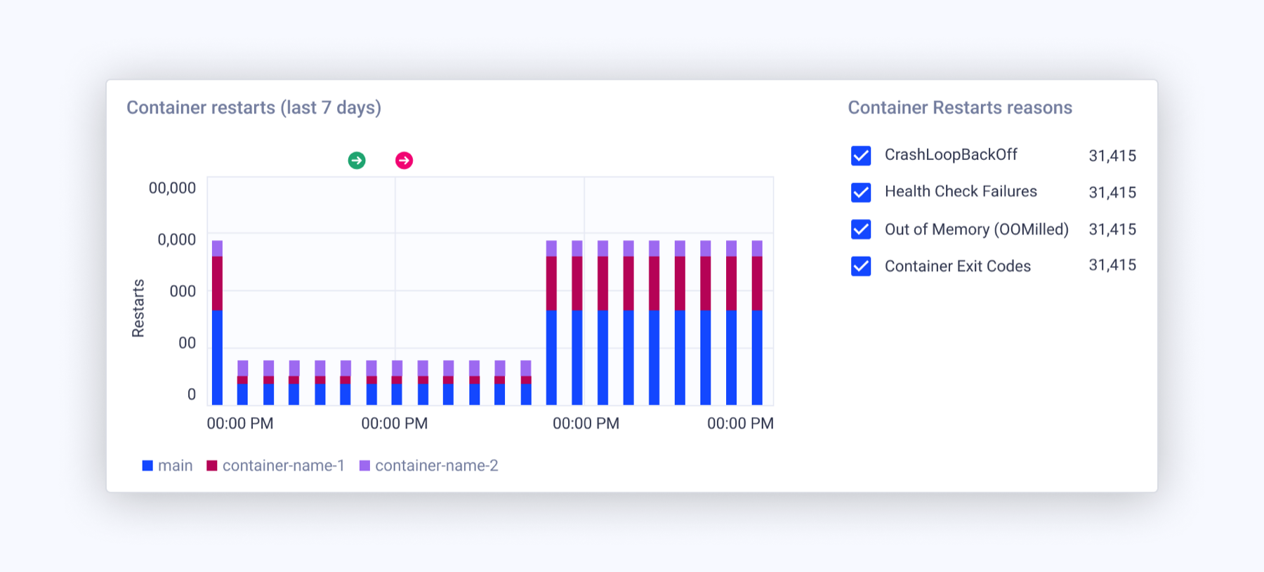
- Container restarts — a stacked bar chart broken down by failure reason (CrashLoopBackOff, OOM, health check failures), because this is a frequency-and-cause problem.
Quick fixes, where they existed
Some violations included inline actions — reconfigure resources, edit HPA — letting users act directly from the violation rather than context-switching elsewhere. These leaned on capabilities the platform had already built, so the design layered a fix path onto existing infrastructure rather than inventing new backend work.
Why this holds up as a pattern
The interesting design decision here wasn't any single screen — it was recognizing that a template needs to flex its middle section to match what the data actually needs to say, while keeping the framing (what / why / how) constant so users never have to relearn the page.